Although I had never seen a Wes Anderson film until very recently, I had always known him to be a quirky, indie, offbeat, and whimsical filmmaker. This assumption most likely grew from friends or family who have mentioned him in conversation, or critics whose reviews I have come across. Additionally, Wes Anderson’s filmmaking style has been parodied on pop culture platforms such as Saturday Night Live, NBC’s Community, an American Express advertisement, and more. When I finally watched my first Wes Anderson film, the 2001 comedic drama The Royal Tenenbaums, I finally understood the humor and charm that is identified with Anderson’s films. However, rather than identifying his unique characters or dry humor, I was completely enamored by his visual artistry and mise en scène. In every shot of The Royal Tenenbaums, Wes Anderson uses deliberate color schemes, negative space, symmetry, or composition to create a visually pleasing picture, evoke an emotion, or give insight into characters (or sometimes, all three). In doing so, Anderson is able to enhance his storytelling past writing, acting or plot, and into visual art.
The first element of this artistry is Anderson’s choice of color. By his deliberate color selection, Anderson assumes the role of not only director but also painter in this film. Examples of this can be found in any given shot of The Royal Tenenbaums.
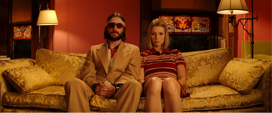
In the image above, we see Richie Tenenbaum (played by Luke Wilson) and Margot Tenenbaum (played by Gwyneth Paltrow) seated on their living room couch, conversing with their father Royal Tenenbaum (played by Gene Hackman), off-screen. The colors in this shot are extremely consistent, using mostly warm tones. The warm tones are used not only in Margot’s red striped shirt and red clip, or in Richie’s beige suit and beige sweatband, but in the couch, lampshades, and walls as well. Anderson considers all components of this shot – costumes, accessories, props, and scenery – when selecting color. To add slight contrast to a primarily warm shot, he adds a light blue to the stained glass windows, bringing out the blue in Richie’s collar and sweatband. He is careful not to overwhelm this shot in one particular color, but uses three or four colors to create a visually pleasing picture.
In the image below, we have another example of consistent colors in the film.
The question still remains of what intention Anderson had in creating these, amongst other, colorfully balanced, consistent, and pleasing shots. In Louis Giannetti’s Understanding Movies (Tenth Edition), the author speaks on the subconscious or psychological impacts that color can have on an audience. Giannetti speaks specifically on the contrast between warm and cool tones. He says, “… cool colors (blue, green, violet) tend to suggest tranquility, aloofness, and serenity” (Giannetti 24) and “Warm colors (red, yellow, orange) suggest aggressiveness, violence and stimulation” (27). If we take these concepts and apply them to shots from The Royal Tenenbaums, we can see the intention behind Anderson’s color schemes. Looking back at the image of Margot and Richie, in the context of the film, the characters are at odds with their estranged father. There is a significant amount of discourse between the characters. Choosing a warm color palette implies a level of aggression and hostility in the atmosphere, very fitting for Margot and Richie in this scene.
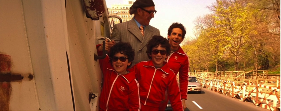
Another example of this can be found in Chas’s, Ari’s, and Usi’s bright red tracksuits, shown below. In the context of the film, Chas is paranoid about the safety of his children. The stimulation of the bright red color reflects Chas’s overly heightened senses, and the matching red suits that Ari and Usi wear emphasize Chas’s influence on his children. In this particular shot, the stimulated bright red is contrasted perfectly with Royal’s duller shades, as Royal is constantly urging Chas to relax throughout the film.
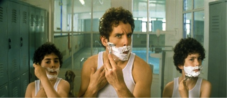
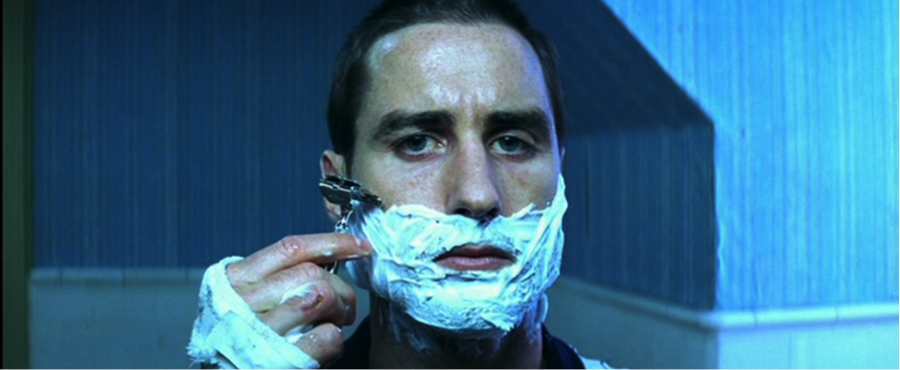
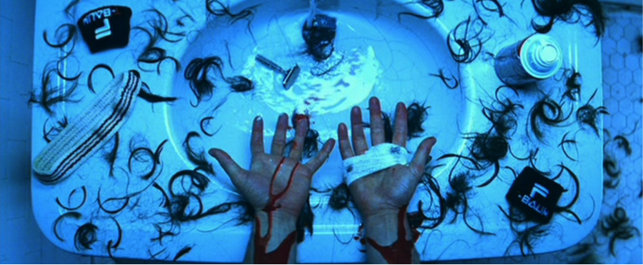
The shot of Chas, Ari and Usi shaving in the gym locker room is a perfect example of the influence of cool colors in film. Chas shuts the world out following the death of his wife. His separation from the world is suggested strongly in these cool tones. More powerful shots that capture the impact of cool tones – as well as the contrast of warm tones – are found in Richie’s attempted suicide scene, shown below.
On the topic of mise en scène, Wes Anderson’s compositional style goes against the grain – thus enhancing his originality and unique storytelling. One example of this in The Royal Tenenbaums is how Anderson puts his subjects in the center of the frame, or has his subjects split center. To many filmmakers and critics, this style is somewhat childish and amateur. In film programs at colleges and universities, student directors are often encouraged not to place subjects directly in the center of the frame (Crow, “The Perfect Symmetry of Wes Anderson’s Movies”). Giannetti writes:
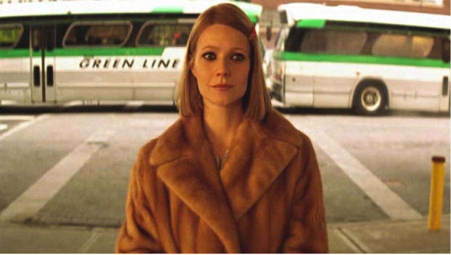
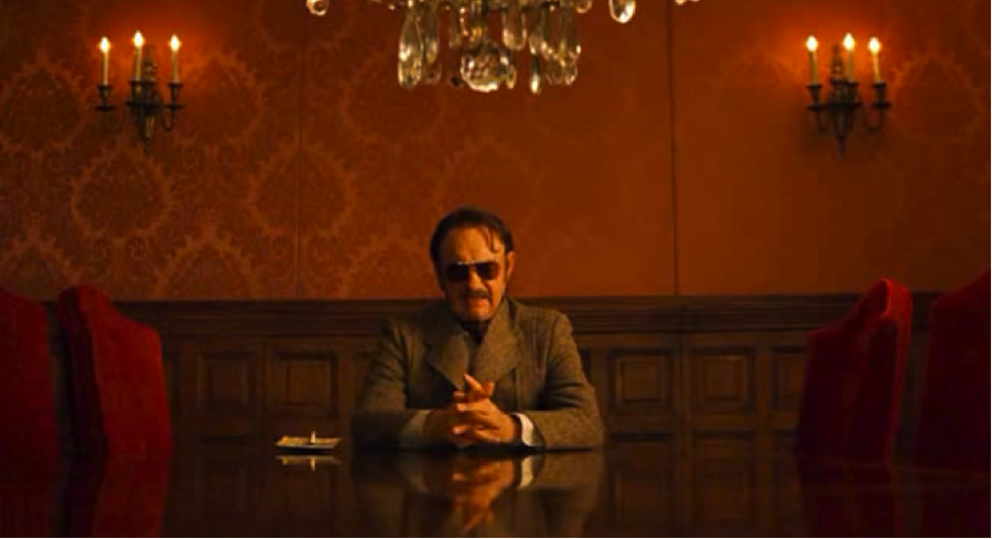
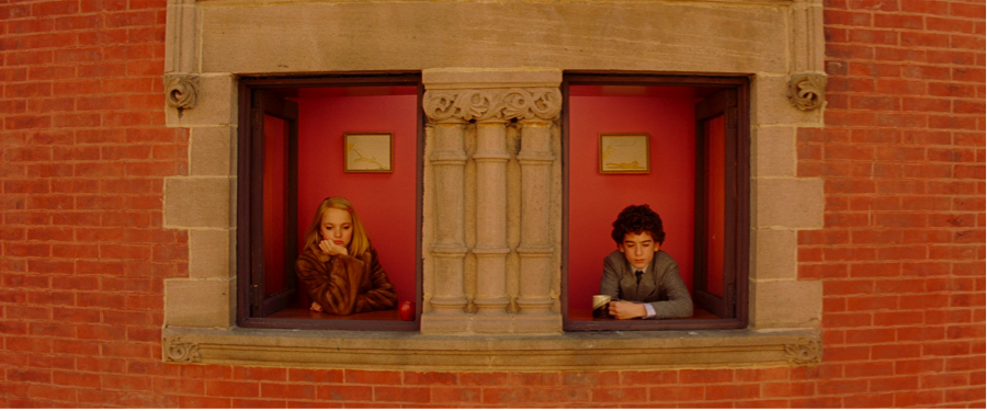
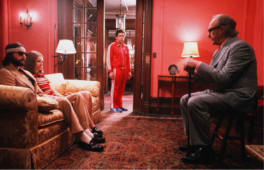
The shots above are examples of easily recognizable symmetry. Anderson’s subjects sit in the center or split center, and are framed by two equal – or mostly equal – sides. In the first shot of Margot, she clearly stands in the center of the frame and is balanced by the identical Green Line buses on either side. Royal also sits in directly in the middle of the second shot, balanced out by two red chairs and three candlesticks on either side. Additionally, Royal shares center with the chandelier, hanging directly above him. The third shot is an example of characters that split center – still creating the same visual effect – and are again balanced out by perfect symmetry on either side of center.
The three shots below are equally balanced, though it might take a second look to identify the symmetry. In each shot, the subject still remains in the center of the frame.
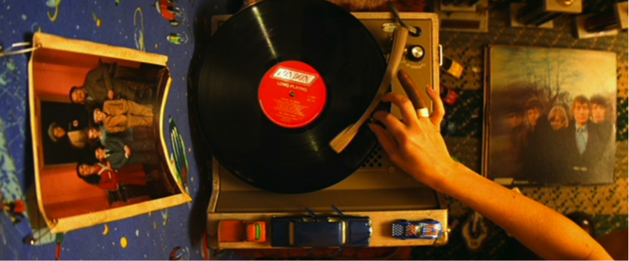
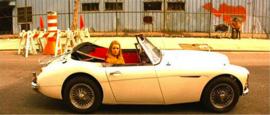
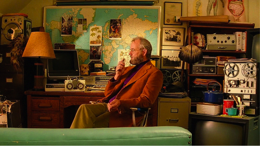
Instead of the mirror effect we receive from the previous three examples, here we have suggestions of balance. For example, in the first image, we see a photo of the Tenenbaum family to the left of the record, and an album cover to the right – both of identical size and shape. To the left of Margot’s car in the second shot we see orange traffic cones, and to the right we see orange graffiti and a man in an orange coat. In the shot of Raleigh St. Clair, he is balanced by an equal amount of props on either side of him; no one side is heavier than the other. Anderson’s intention in including so many balanced, symmetrical shots is a brilliant and ironic contrast to the characters in the story, which are anything but balanced or centered.
A final visual element of The Royal Tenenbaums that assists in telling the story is Anderson’s composition. Aside from color, his staging, proportion, and use of space are the strongest elements that suggest character or mood. In this first example above, without knowing the context, we can assume that the character standing in the background is somehow separate from the three characters seated in the foreground. Sure enough, within the context, Chas is the only Tenenbaum child that is not comfortable with his estranged father moving back in. The harsh dialogue between the two during this scene would not be nearly as effective if Chas were not physically separate from his family (as he is mentally). Additionally, the characters are placed so that Royal, the father, appears much larger than his children, Richie, Chas, and Margot. Although the characters are now full-grown adults, it is a comical commentary on their new relationship. This visual effect is achieved by placing Chas in the background, Royal in a small chair, and Richie and Margot on a large couch.
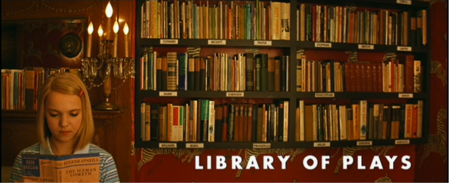
The shot above digs deeply into the life of young Margot Tenenbaum. The use of negative space to her right, filled only with her plays, strongly suggests young Margot’s isolation from others. The presence of her plays in the negative space suggests the emptiness in her young life being taken up by her work – an emptiness that is undoubtedly caused by Royal referring to her as “my adopted daughter.”
Similarly, if we look again at the above image of Richie’s suicide attempt, we see a significant of negative space around him. To put that into context, Richie feels completely empty inside, and there is nothing that can fill that emptiness.
Although Wes Anderson’s successful filmmaking style, especially in The Royal Tenenbaums, may be defined by his choice of actors (Billy Murray, Angelica Houston, the Wilson brothers, etc.), his offbeat humor and honest writing, or interesting plot and characters, to me it is his visual style that garners his success in this film. Whether a shot is completely symmetrical, the subject totally centered, filled with negative space, or color-coordinated, Anderson is always incredibly conscious of tailoring each element on the screen to create a pleasing picture, evoke an emotion, or describe a character. Whether the audience is conscious of it or not, every detail of every shot, from its color to its composition to its mise en scène, effects the viewer’s experience. He has proven that The Royal Tenenbaums is as much visual art as it is film.